



Inter Smart
Talk to our expert today
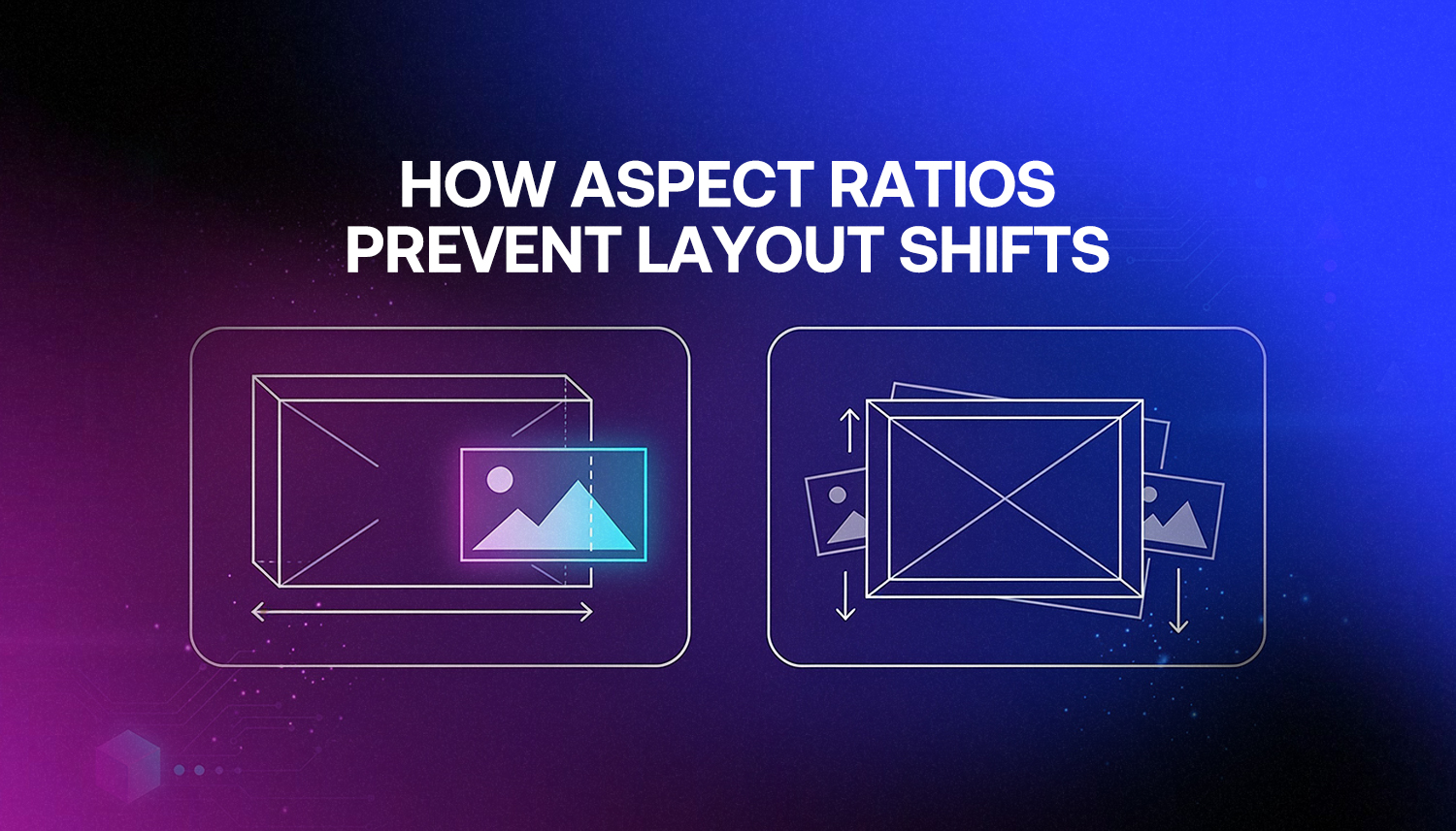
Have you ever tapped a button and watched the page jump right under your hand, so you hit the wrong option? That jump is a layout shift.
One simple fix is to set an aspect ratio for images and videos. It helps the page plan space early.
This is not only theory. Google measures layout stability, and CLS is part of Core Web Vitals. When your CLS scores poorly, it can affect how well you show up in search. It can also feel flaky to visitors, since things move while they try to read or click.
| If the browser cannot tell the size of an image or a video up front, it leaves no room as a placeholder. Once the media finally loads, the page has to redo the layout, and the content moves to make space.
By setting an aspect ratio, you give the browser a clear guide for how much area to keep ready before the file appears. After that, the page does not wobble as the media comes in. |
This article explains how aspect ratios work, why they fix layout shifts, and how to apply them correctly.
A layout shift is when visible content on a page moves unexpectedly while loading.
Here’s what causes it: the browser starts rendering a page top to bottom. Once it encounters the image or video, it is not yet aware of how tall the image will be. That way, it avoids the space and continues rendering the rest. Once the image appears, it stretches 400px high and shifts all of the elements under it 400px down. This results in a noticeable jump.
This is frustrating to users. They are reading, and it’s moving. They are about to click, and the target moves. It’s a ranking issue for the owner of the website.
Google’s definition of a good CLS is under 0.1. If 0.25 or higher, the result will be considered poor.
Back then, many browsers could not tell an image size until the file had already begun to download. So the layout had a missing block in the middle. When the image finally came in, the page moved to make room. The image only got the right space after the full download finished.
From 2019, browsers started to use the width and height attributes of image tags to determine aspect ratio.
This is the mechanism. Aspect ratio equals height reserved equals no layout shift.
For most images, the fix is one line. Just add width and height attributes to your image tags.
| <img src=”banner.jpg” width=”1200″ height=”600″ alt=”Banner image”> |
That single addition gives the browser everything it needs. It does some calculations (1200/600 = 2:1 ratio, reserves the size of the image height), and the image slots in nicely once it’s loaded.
Your responsive CSS will still work! The browser will adhere to the intrinsic ratio specified in the attributes even if you set max-width: 100% and height: auto in your stylesheet. The space stays reserved proportionally as the image scales down on smaller screens.
Note that if you have set width and height attributes, don’t set width: auto in CSS. That will override the browser’s default ratio and cancel out the reserved space. Instead, use height: auto; max-width: 100%.
Videos embedded directly use the same principle as images. Add width and height attributes to the <video> tag, and the browser handles it the same way.
Iframes are different. YouTube embeds, Google Maps, and other third-party iframes don’t calculate an aspect ratio from their attributes. They default to 300×150 pixels regardless of what you set. The fix here is a CSS technique called the aspect ratio box.
Here’s the CSS approach:
| .video-wrapper {
position: relative; padding-bottom: 56.25%; /* 16:9 ratio */ height: 0; } .video-wrapper iframe { position: absolute; top: 0; left: 0; width: 100%; height: 100%; } |
The padding-bottom: 56.25% comes from dividing 9 by 16. For a 4:3 ratio, use 75%. The wrapper holds its proportional height, and the iframe fills it completely. No shift when the embed loads.
Alternatively, modern browsers support the CSS aspect-ratio property directly:
| .video-wrapper {
aspect-ratio: 16 / 9; width: 100%; } |
This is cleaner and easier to read. Browser support is strong across all modern browsers. For older browser compatibility, the padding-bottom method is more reliable.
Ads are one of the most common causes of poor CLS scores. An ad slot that loads after the page is already visible pushes content downward, and that shift is measured by Google.
The fix is to reserve the space upfront, before the ad loads. Set a min-height on the ad container that matches the expected ad size.
| .ad-container {
min-height: 250px; background: #f5f5f5; /* optional placeholder */ } |
If no ad returns, the space stays reserved. That’s the right behaviour. Collapsing the reserved space when an ad doesn’t load causes a second shift, which also counts against your CLS score.
The same principle applies to any dynamic content: accordions, skeleton loaders, content injected by JavaScript. If it’s going to appear on screen and push things around, reserve its space before it arrives.
Here’s how the two approaches compare in practice:
| Scenario | Without Aspect Ratio | With Aspect Ratio |
| Image loading | Page jumps when image appears | Space reserved, no jump |
| Video embed | Content shifts down on load | Container holds its size |
| Ad slot | Text moves when ad renders | Ad slot pre-reserved |
| CLS score | Often 0.1 or higher (Poor) | Closer to 0 (Good) |
| Google ranking impact | Penalised by Core Web Vitals | Stable performance signal |
Google provides two free tools for this.
One option is PageSpeed Insights. Put in your site URL, start the check, and you will see your CLS score in the Core Web Vitals area. It also points to the page parts that trigger the layout shifts. That narrows the search fast.
The next tool is Google Search Console. In the Core Web Vitals section, you can see how CLS looks on every page. It is based on real user visits, not on test runs in a lab. This is also the information Google looks at when it decides how your site ranks.
A CLS score of 0 means no layout shifts at all. A score of 0.1 or below is good. Above 0.25 is poor and worth fixing before anything else.
CLS is one of three Core Web Vitals. Google uses it as a direct ranking signal. The other two are Largest Contentful Paint and Interaction to Next Paint. Largest Contentful Paint is linked to loading speed. Interaction to Next Paint measures how fast the page responds.
If your CLS is not good, your pages may lose spots in search results. This can still occur even if your content is strong. Google seems to care about motion during load. If items shift or jump while the page is loading, users do not like it. Google also aims to avoid giving a boost to those same types of bad experiences.
Beyond rankings, it’s a real usability problem. Users who click the wrong thing because the page shifted often don’t come back. For a business, that’s a conversion lost to a technical oversight that’s entirely fixable.
Getting CLS right requires attention at the development stage, not as an afterthought. Every image needs dimensions. Every embedded video needs a container. Ad slots need reserved space. Dynamic content needs to be planned.
Inter Smart is a web designing company in Kochi that builds websites with Core Web Vitals performance built in from the start. CLS, loading speed, and mobile responsiveness are part of every project, not optional extras checked at the end.
As a trusted website design company in Kochi, Inter Smart works with businesses across Kerala to build sites that perform well in search and hold up in real-world conditions. A site that loads cleanly, stays visually stable, and scores well on Google’s technical benchmarks ranks better and converts better.
If your site has layout shift issues or you want to build a new website that gets this right from day one, talk to Inter Smart.
Need guidance? Request a callback, and our expert will reach out at your convenience.